McPicker alternatives and similar libraries
Based on the "PickerView" category.
Alternatively, view McPicker alternatives based on common mentions on social networks and blogs.
-
-
SKCountryPicker
A simple, customizable Country picker for picking country or dialing code. 🇮🇳 🇯🇵 🇰🇷 🇩🇪 🇨🇳 🇺🇸 🇫🇷 🇪🇸 🇮🇹 🇷🇺 🇬🇧 -
ADDatePicker
A fully customizable iOS Horizontal PickerView library, written in pure swift -
AIDatePickerController
📅 UIDatePicker modally presented with iOS 7 custom transitions.

WorkOS - The modern identity platform for B2B SaaS

* Code Quality Rankings and insights are calculated and provided by Lumnify.
They vary from L1 to L5 with "L5" being the highest.
Do you think we are missing an alternative of McPicker or a related project?

|
InfluxDB - Power Real-Time Data Analytics at Scale
sponsored
www.influxdata.com
|
Popular Comparisons
-
McPickervsD2PDatePicker
-
McPickervsMandoline
-
McPickervsAIDatePickerController
-
McPickervsSKCountryPicker
-
McPickervsD2PDatePicker

|
SaaSHub - Software Alternatives and Reviews
sponsored
www.saashub.com
|
README
McPicker


About
McPicker is a UIPickerView drop-in solution with animations that is rotation ready. The more string arrays you pass, the more picker components you'll get. You can set custom label or use the defaults. McPicker can be presented as a Popover on iPhone or iPad using showAsPopover, as an inputView using McTextField or use the default slide up and down style show.
showAsPopover can be used to display from a UIView or UIBarButtonItem. showAsPopover will always be presented as a Popover, even when used on an iPhone.
Usage
To run the example project, clone the repo, and run pod install from the Example directory first.
Short Syntax
- Normal - (Slide up from bottom)
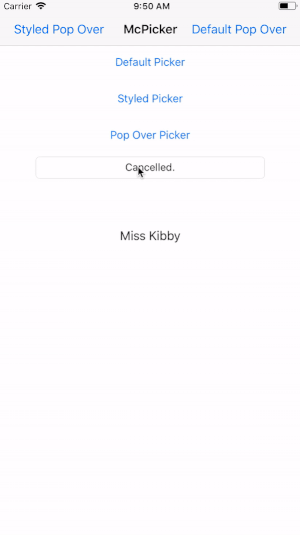
swift McPicker.show(data: [["Kevin", "Lauren", "Kibby", "Stella"]]) { [weak self] (selections: [Int : String]) -> Void in if let name = selections[0] { self?.label.text = name } } - As Popover
swift
let data: [[String]] = [["Kevin", "Lauren", "Kibby", "Stella"]]
McPicker.showAsPopover(data: data, fromViewController: self, barButtonItem: sender) { [weak self] (selections: [Int : String]) -> Void in
if let name = selections[0] {
    self?.label.text = name
}
}
As an
inputViewviaMcTextField@IBOutlet weak var mcTextField: McTextField! override func viewDidLoad() { let data: [[String]] = [["Kevin", "Lauren", "Kibby", "Stella"]] let mcInputView = McPicker(data: data) mcInputView.backgroundColor = .gray mcInputView.backgroundColorAlpha = 0.25 mcTextField.inputViewMcPicker = mcInputView mcTextField.doneHandler = { [weak mcTextField] (selections) in mcTextField?.text = selections[0]! } mcTextField.selectionChangedHandler = { [weak mcTextField] (selections, componentThatChanged) in mcTextField?.text = selections[componentThatChanged]! } mcTextField.cancelHandler = { [weak mcTextField] in mcTextField?.text = "Cancelled." } mcTextField.textFieldWillBeginEditingHandler = { [weak mcTextField] (selections) in if mcTextField?.text == "" { // Selections always default to the first value per component mcTextField?.text = selections[0] } } }
Customization
let data: [[String]] = [
    ["Sir", "Mr", "Mrs", "Miss"],
    ["Kevin", "Lauren", "Kibby", "Stella"]
]
let mcPicker = McPicker(data: data)

let customLabel = UILabel()
customLabel.textAlignment = .center
customLabel.textColor = .white
customLabel.font = UIFont(name:"American Typewriter", size: 30)!
mcPicker.label = customLabel // Set your custom label

let fixedSpace = McPickerBarButtonItem.fixedSpace(width: 20.0)
let flexibleSpace = McPickerBarButtonItem.flexibleSpace()
let fireButton = McPickerBarButtonItem.done(mcPicker: mcPicker, title: "Fire!!!") // Set custom Text
let cancelButton = McPickerBarButtonItem.cancel(mcPicker: mcPicker, barButtonSystemItem: .cancel) // or system items
// Set custom toolbar items
mcPicker.setToolbarItems(items: [fixedSpace, cancelButton, flexibleSpace, fireButton, fixedSpace])

mcPicker.toolbarItemsFont = UIFont(name:"American Typewriter", size: 17)!
mcPicker.toolbarButtonsColor = .white
mcPicker.toolbarBarTintColor = .darkGray
mcPicker.backgroundColor = .gray
mcPicker.backgroundColorAlpha = 0.50
mcPicker.pickerBackgroundColor = .gray
mcPicker.pickerSelectRowsForComponents = [
    0: [3: true],
    1: [2: true] // [Component: [Row: isAnimated]
]

if let barButton = sender as? UIBarButtonItem {
    // Show as Popover
    //
    mcPicker.showAsPopover(fromViewController: self, barButtonItem: barButton) { [weak self] (selections: [Int : String]) -> Void in
        if let prefix = selections[0], let name = selections[1] {
            self?.label.text = "\(prefix) \(name)"
        }
    }
} else {
    // Show Normal
    //
    mcPicker.show(doneHandler: { [weak self] (selections: [Int : String]) -> Void in
        if let prefix = selections[0], let name = selections[1] {
            self?.label.text = "\(prefix) \(name)"
        }
    }, cancelHandler: {
        print("Canceled Styled Picker")
    }, selectionChangedHandler: { (selections: [Int:String], componentThatChanged: Int) -> Void  in
        let newSelection = selections[componentThatChanged] ?? "Failed to get new selection!"
        print("Component \(componentThatChanged) changed value to \(newSelection)")
    })
}
The selections
McPicker's doneHandler passes back selections: [Int : String] as an argument. This is as simple as [<Component Index>: <String of Selection>] from the data you've passed in.
Requirements
- iOS 8+
- Swift 5.2
- Xcode 12
Note: Starting in 0.5.1 McPicker uses the Swift 4 Compiler. Ensure the correct compiler is set in your project.. If you'd like to use Swift 3 use version <=0.5.0.
Installation
McPicker is available through CocoaPods. To install it, simply add the following line to your Podfile:
pod "McPicker"
Xcode 12+ - Swift 5.2 Support
pod 'McPicker', '~> 3.0.0'
Swift 4.2 Support
For Swift 4.2 support, please use version 2.0.0.
pod 'McPicker', '~> 2.0.0'
Author
Kevin McGill, [email protected]
License
McPicker is available under the MIT license. See the LICENSE file for more info.
*Note that all licence references and agreements mentioned in the McPicker README section above
are relevant to that project's source code only.