MTCircularSlider alternatives and similar libraries
Based on the "UI" category.
Alternatively, view MTCircularSlider alternatives based on common mentions on social networks and blogs.
-
-
DZNEmptyDataSet
A drop-in UITableView/UICollectionView superclass category for showing empty datasets whenever the view has no content to display -
-
-
-
-
IQKeyboardManager
Codeless drop-in universal library allows to prevent issues of keyboard sliding up and cover UITextField/UITextView. Neither need to write any code nor any setup required and much more. -
-
SkeletonView
☠️ An elegant way to show users that something is happening and also prepare them to which contents they are awaiting -
animated-tab-bar
:octocat: RAMAnimatedTabBarController is a Swift UI module library for adding animation to iOS tabbar items and icons. iOS library made by @Ramotion -
-
TTTAttributedLabel
A drop-in replacement for UILabel that supports attributes, data detectors, links, and more -
-
-
MGSwipeTableCell
An easy to use UITableViewCell subclass that allows to display swippable buttons with a variety of transitions. -
JTAppleCalendar
The Unofficial Apple iOS Swift Calendar View. Swift calendar Library. iOS calendar Control. 100% Customizable -
-
SWTableViewCell
An easy-to-use UITableViewCell subclass that implements a swippable content view which exposes utility buttons (similar to iOS 7 Mail Application) -
-
JVFloatLabeledTextField
UITextField subclass with floating labels - inspired by Matt D. Smith's design: http://dribbble.com/shots/1254439--GIF-Mobile-Form-Interaction?list=users -
-
XLForm
XLForm is the most flexible and powerful iOS library to create dynamic table-view forms. Fully compatible with Swift & Obj-C. -
FSPagerView
FSPagerView is an elegant Screen Slide Library. It is extremely helpful for making Banner View、Product Show、Welcome/Guide Pages、Screen/ViewController Sliders. -
TPKeyboardAvoiding
A drop-in universal solution for moving text fields out of the way of the keyboard in iOS -
SideMenu
Simple side/slide menu control for iOS, no code necessary! Lots of customization. Add it to your project in 5 minutes or less. -
SwipeCellKit
Swipeable UITableViewCell/UICollectionViewCell based on the stock Mail.app, implemented in Swift. -
-
-
Alerts & Pickers
Advanced usage of UIAlertController and pickers based on it: Telegram, Contacts, Location, PhotoLibrary, Country, Phone Code, Currency, Date... -
SwiftEntryKit
SwiftEntryKit is a presentation library for iOS. It can be used to easily display overlays within your iOS apps. -
-
-
PageMenu
A paging menu controller built from other view controllers placed inside a scroll view (like Spotify, Windows Phone, Instagram) -
Material Components
[In maintenance mode] Modular and customizable Material Design UI components for iOS -
SWRevealViewController
A UIViewController subclass for presenting side view controllers inspired on the FaceBook and Wunderlist apps, done right ! -
CSStickyHeaderFlowLayout
UICollectionView replacement of UITableView. Do even more like Parallax Header, Sticky Section Header. Made for iOS 7. -
expanding-collection
:octocat: ExpandingCollection is an animated material design UI card peek/pop controller. iOS library made by @Ramotion

InfluxDB - Power Real-Time Data Analytics at Scale


* Code Quality Rankings and insights are calculated and provided by Lumnify.
They vary from L1 to L5 with "L5" being the highest.
Do you think we are missing an alternative of MTCircularSlider or a related project?

|
WorkOS - The modern identity platform for B2B SaaS
sponsored
workos.com
|
Popular Comparisons
-
MTCircularSlidervsLTNavigationBar
-
MTCircularSlidervsswift-badge
-
MTCircularSlidervsPTPopupWebView
-
MTCircularSlidervsAMScrollingNavbar
-
MTCircularSlidervsSwiftMessages

|
SaaSHub - Software Alternatives and Reviews
sponsored
www.saashub.com
|
README
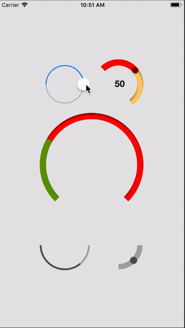
MTCircularSlider


Screenshot
Usage
To run the example project, clone the repo, and run pod install from the Example directory first.
Requirements
- iOS 10.0+
Installation
CocoaPods (iOS 10.0+)
MTCircularSlider is available through CocoaPods. To install it, simply add the following line to your Podfile:
pod "MTCircularSlider"
Manual Installation
The class file required for MTCircularSlider can be found in the following path:
MTCircularSlider/Classes/MTCircularSlider.swift
Usage
To run the example project, clone the repo and run pod install from the Example directory first.
MTCircularSlider implements IBDesignable and IBInspectable, and so can be configure directly from Interface Builder.
Usage in Code - Simple
To add a default circular slider, add the following code to your controller:
self.slider = MTCircularSlider(frame: self.sliderArea.bounds, options: nil)
self.slider?.addTarget(self, action: Selector("valueChange:"), forControlEvents: .ValueChanged)
self.sliderArea.addSubview(self.slider)
Usage in Code - Advanced
To add a custom circular slider, add the following code to your controller:
let attributes = [
/* Track */
Attributes.minTrackTint(.lightGray),
Attributes.maxTrackTint(.lightGray),
Attributes.trackWidth(12),
Attributes.trackShadowRadius(0),
Attributes.trackShadowDepth(0),
Attributes.trackMinAngle(180),
Attributes.trackMaxAngle(270),

/* Thumb */
Attributes.hasThumb(true),
Attributes.thumbTint(UIColor.darkGrayColor()),
Attributes.thumbRadius(8),
Attributes.thumbShadowRadius(0),
Attributes.thumbShadowDepth(0)
]

self.slider = MTCircularSlider(frame: self.sliderArea.bounds, options: nil)
self.slider.configure(attributes)
self.slider?.addTarget(self, action: Selector("valueChange:"), forControlEvents: .ValueChanged)
self.sliderArea.addSubview(self.slider)
Attributes
minTrackTint(UIColor)
Sets the color of the track up to the thumb.
maxTrackTint(UIColor)
Sets the color of the track from the thumb to the end of the track.
trackWidth(CGFloat)
Sets the width of the track in points.
Default value: 2
trackShadowRadius(CGFloat)
Sets the radius for the inner shadow on the track.
trackShadowDepth(CGFloat)
Sets the distance of the inner shadow on the track from the track edge.
trackMinAngle(Double)
Sets the minimum angle of the track in degrees.
Default value: 0
trackMaxAngle(Double)
Sets the maximum angle of the track in degrees.
Default value: 360
maxWinds(Float)
Sets the maximum number of times a user can wind the control. If set to a value other than 1, the difference between the minimum and maximum angles must be exactly 360 degrees.
Default value: 1
hasThumb(Bool)
Toggles the control between progress and slider modes. Setting hasThumb to true set the control to slider mode.
thumbTint(UIColor)
Sets the color of the thumb.
thumbRadius(CGFloat)
Sets the radius of the thumb in points.
thumbShadowRadius(CGFloat)
Sets the radius of the shadow the thumb drops.
thumbShadowDepth(CGFloat)
Sets the distance of the shadow the thumb from the thumb.
Functions
getThumbAngle() -> CGFloat
Returns the current angle of the thumb in radians.
Author
Eran Boudjnah, [email protected]
License
MTCircularSlider is available under the MIT license. See the LICENSE file for more info.
*Note that all licence references and agreements mentioned in the MTCircularSlider README section above
are relevant to that project's source code only.