EMEmojiableBtn alternatives and similar libraries
Based on the "Button" category.
Alternatively, view EMEmojiableBtn alternatives based on common mentions on social networks and blogs.
-
LGButton
A fully customisable subclass of the native UIControl which allows you to create beautiful buttons without writing any line of code. -
-
-
PMSuperButton
🔥 PMSuperButton is a powerful UIButton coming from the countryside, but with super powers! 😎 -
-
-
-
ButtonProgressBar-iOS
A small and flexible (well documented) UIButton subclass with animated loading progress, and completion animation. -
NFDownloadButton
Revamped Download Button. It's kinda a reverse engineering of Netflix's app download button. -
JOEmojiableBtn
Since Facebook introduced reactions in 2016, it became a standard in several applications as a way for users to interact with content. ReactionButton is a control that allows developers to add this functionality to their apps in an easy way. -
-
FlowBarButtonItem
DISCONTINUED. Bar Button Item that can be moved anywhere in the screen, like Android's stickers button. -
DesignableButton
A Custom UIButton with Centralised Styling and common styles available in Interface Builder -
AnimatablePlayButton
Animated Play and Pause Button written in Swift, using CALayer, CAKeyframeAnimation. -
JSButton
A fully customisable swift subclass on UIButton which allows you to create beautiful buttons without writing any line of code.
InfluxDB - Power Real-Time Data Analytics at Scale


* Code Quality Rankings and insights are calculated and provided by Lumnify.
They vary from L1 to L5 with "L5" being the highest.
Do you think we are missing an alternative of EMEmojiableBtn or a related project?


README
EMEmojiableBtn


Usage
To run the example project, clone the repo, and run pod install from the Example directory first.
There's also an Swift implementation developed by lojals.
Installation
EMEmojiableBtn is available through CocoaPods. To install it, simply add the following line to your Podfile:
pod "EMEmojiableBtn"
Examples
1. Basic Instance
Example Code
EMEmojiableBtn *button = [[EMEmojiableBtn alloc] initWithFrame:CGRectMake(20, 150, 52.0, 52.0)];
button.delegate = self;
button.dataset = @[
    [[EMEmojiableOption alloc] initWithImage:@"img_1" withName:@"dislike"],
    [[EMEmojiableOption alloc] initWithImage:@"img_2" withName:@"broken"],
    [[EMEmojiableOption alloc] initWithImage:@"img_3" withName:@"he he"],
    [[EMEmojiableOption alloc] initWithImage:@"img_4" withName:@"ooh"],
    [[EMEmojiableOption alloc] initWithImage:@"img_5" withName:@"meh !"],
    [[EMEmojiableOption alloc] initWithImage:@"img_6" withName:@"ahh !"]
];
[button setImage:[UIImage imageNamed:@"img_1"] forState:UIControlStateNormal];
[self.view addSubview:button];
2. Custom styled instance
Example Code
With this instance you can fully custom your component. Following the EMEmojiableBtnConfig variables.
You can custom your selector with the following variables, used in the

EMEmojiableBtnConfig *config = [[EMEmojiableBtnConfig alloc] init];
config.spacing = 6.0;
config.size = 30.0;
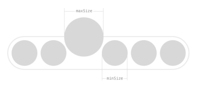
config.minSize = 34.0;
config.maxSize = 45.0;
config.s_options_selector = 30.0;
EMEmojiableBtn *button = [[EMEmojiableBtn alloc] initWithFrame:CGRectMake(20, 150, 52.0, 52.0) withConfig:config];
button.delegate = self;
button.dataset = @[
[[EMEmojiableOption alloc] initWithImage:@"img_1" withName:@"dislike"],
[[EMEmojiableOption alloc] initWithImage:@"img_2" withName:@"broken"],
[[EMEmojiableOption alloc] initWithImage:@"img_3" withName:@"he he"],
[[EMEmojiableOption alloc] initWithImage:@"img_4" withName:@"ooh"],
[[EMEmojiableOption alloc] initWithImage:@"img_5" withName:@"meh !"],
[[EMEmojiableOption alloc] initWithImage:@"img_6" withName:@"ahh !"]
];
[button setImage:[UIImage imageNamed:@"img_1"] forState:UIControlStateNormal];
[self.view addSubview:button];

Available customization options using EMEmojiableBtnConfig
size- Size of each available optionmaxSize- Size of option when it is hilightedminSize- Size of options when one option is hilighted. When option is hilighted other options are smallerspacing- Spacing between optionss_options_selector- Bottom space of option selector view to button and information viewbackgroundColor- Background color of screen when options selector is active after UILongPressGestureRecognizeroptionsViewInitialAlpha- Initial opacity of options listing viewoptionsViewBackgroundColor- Background color of options listing viewoptionsViewShadowColor- Shadow color of options listing viewoptionsViewShadowOpacity- Opacity of options listing shadowoptionsViewShadowOffset- Offset of options listing shadowinformationViewBackgroundColor- Background color of information viewinformationViewDotsColor- Dots color of information viewinformationViewBorderColor- Border color of information viewinformationViewFont- Font of information viewinformationViewTextColor- Text color of information viewinformationViewText- Text for information view. Default : Release to cancel
Author
Erekle, [email protected]
License
EMEmojiableBtn is available under the MIT license. See the LICENSE file for more info.
*Note that all licence references and agreements mentioned in the EMEmojiableBtn README section above
are relevant to that project's source code only.