StackLayout alternatives and similar libraries
Based on the "UI" category.
Alternatively, view StackLayout alternatives based on common mentions on social networks and blogs.
-
-
DZNEmptyDataSet
DISCONTINUED. A drop-in UITableView/UICollectionView superclass category for showing empty datasets whenever the view has no content to display -
-
-
-
-
IQKeyboardManager
Codeless drop-in universal library allows to prevent issues of keyboard sliding up and cover UITextField/UITextView. Neither need to write any code nor any setup required and much more. -
-
SkeletonView
☠️ An elegant way to show users that something is happening and also prepare them to which contents they are awaiting -
animated-tab-bar
:octocat: RAMAnimatedTabBarController is a Swift UI module library for adding animation to iOS tabbar items and icons. iOS library made by @Ramotion -
-
TTTAttributedLabel
A drop-in replacement for UILabel that supports attributes, data detectors, links, and more -
-
-
MGSwipeTableCell
An easy to use UITableViewCell subclass that allows to display swippable buttons with a variety of transitions. -
JTAppleCalendar
The Unofficial Apple iOS Swift Calendar View. Swift calendar Library. iOS calendar Control. 100% Customizable -
-
SWTableViewCell
An easy-to-use UITableViewCell subclass that implements a swippable content view which exposes utility buttons (similar to iOS 7 Mail Application) -
-
JVFloatLabeledTextField
UITextField subclass with floating labels - inspired by Matt D. Smith's design: http://dribbble.com/shots/1254439--GIF-Mobile-Form-Interaction?list=users -
-
XLForm
XLForm is the most flexible and powerful iOS library to create dynamic table-view forms. Fully compatible with Swift & Obj-C. -
FSPagerView
FSPagerView is an elegant Screen Slide Library. It is extremely helpful for making Banner View、Product Show、Welcome/Guide Pages、Screen/ViewController Sliders. -
TPKeyboardAvoiding
A drop-in universal solution for moving text fields out of the way of the keyboard in iOS -
SideMenu
Simple side/slide menu control for iOS, no code necessary! Lots of customization. Add it to your project in 5 minutes or less. -
SwipeCellKit
Swipeable UITableViewCell/UICollectionViewCell based on the stock Mail.app, implemented in Swift. -
-
-
Alerts & Pickers
Advanced usage of UIAlertController and pickers based on it: Telegram, Contacts, Location, PhotoLibrary, Country, Phone Code, Currency, Date... -
SwiftEntryKit
SwiftEntryKit is a presentation library for iOS. It can be used to easily display overlays within your iOS apps. -
-
-
PageMenu
A paging menu controller built from other view controllers placed inside a scroll view (like Spotify, Windows Phone, Instagram) -
Material Components
[In maintenance mode] Modular and customizable Material Design UI components for iOS -
SWRevealViewController
A UIViewController subclass for presenting side view controllers inspired on the FaceBook and Wunderlist apps, done right ! -
CSStickyHeaderFlowLayout
UICollectionView replacement of UITableView. Do even more like Parallax Header, Sticky Section Header. Made for iOS 7. -
expanding-collection
:octocat: ExpandingCollection is an animated material design UI card peek/pop controller. iOS library made by @Ramotion

WorkOS - The modern identity platform for B2B SaaS


* Code Quality Rankings and insights are calculated and provided by Lumnify.
They vary from L1 to L5 with "L5" being the highest.
Do you think we are missing an alternative of StackLayout or a related project?


README
StackLayout


StackLayout builds on Auto Layout to make some of the most common layouts easier to manage. It creates the constraints that you need and allows you to edit them with semantic method names, like setTopMargin: or setHorizontalAlignment:. It is similar to UIStackView, but unlike UIStackView it is not a subclass of UIView. It is a layout manager you can use with any view. This has a few advantages:
- Multiple layouts in one view.
- Less wrapper views in your layout.
- Compatible with iOS 8+
Basics
Three labels stacked vertically, hugging the top, with a space between them.
let verticalLayout = container.addSubviewsWithVerticalLayout([headerLabel, subtitleLabel, bodyLabel]) { layout in
    layout.verticalAlignment = .Top
    layout.horizontalAlignment = .Fill
}
The above layout takes about 10 constraints usually, which can be a hassle to manage. The layout object manages them for you and allows you to easily change them later. You don't need to keep a reference to the layout object if you don't need it though.
More examples
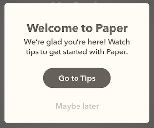
tipView.addSubviewsWithVerticalLayout([titleLabel, bodyLabel, tipsButton, laterButton]) { layout in
    layout.verticalAlignment = .Fill
    layout.verticalMargins = 46
    layout.topMargin = 34
    layout.bottomMargin = 17
    layout.spacing = 28
    layout.setSpacing(10, between: titleLabel, and: bodyLabel)
}

// Constrain the width of the tip view so the text will wrap.
tipView.widthAnchor.constraintEqualToConstant(290).active = true

toolbar.addSubviewsWithHorizontalLayout([trashButton]) { layout in
    layout.horizontalAlignment = .Leading
    layout.verticalAlignment = .Center
    layout.leadingMargin = 15
}

toolbar.addSubviewsWithHorizontalLayout([resizeButton, spotlightButton]) { layout in
    layout.verticalAlignment = .Center
    layout.horizontalAlignment = .Center
}
Most used properties
spacing
setSpacing:betweenView:andView:
(vertical)(horizontal)Alignment
(vertical)(horizontal)Margins
(top)(bottom)(leading)(horizontal)Margin
Alignment
You usually want to choose both a vertical and horizontal alignment.
- SLAlignmentFill
- Use this when you want the subviews to completely fill the container (exluding space for margins). This can also make the container shrink until it is just big enough to hold the subviews. This is the most common alignment.
- SLAlignmentTop/Bottom/Leading/Trailing
- Just as it sounds. The view(s) will be stuck to the margin of the container view.
- SLAlignmentCenter
- This pulls the views to the middle. The layout might create invisible "helper" views to accomplish this. You can control the strength of the centering constraints using
centeringPriority.
- This pulls the views to the middle. The layout might create invisible "helper" views to accomplish this. You can control the strength of the centering constraints using
- SLAlignmentNone
- This is the default. Without an alignment the views can be layed out anywhere within the margins of the container. This is only useful when you want to align the views relative to something else in the view hierarchy.
Spacing
All ajdacent subviews have a "space" constraint for the space between them. In the Auto Layout Visual Format Language, it looks like "[first]-space-[second]". By default, this space is set to 0 so all subviews are edge-to-edge. You can set the space between two adjacent subviews by calling setSpacing:betweenView:andView:. You can also adjust the spacing constraints at once by setting spacing, which will override any other previous setSpacing:betweenView:andView: calls.
Spacing constraints are required by default, but can be weakened by setting spacingPriority.
Rules to Remember
If you are working with a layout where these rules are getting in the way, don't be afraid to just ditch Stack Layout and make the constraints yourself! PureLayout or NSLayoutAnchor (iOS 9+) make this easier.
Set both vertical and horizontal alignments
If you don't set an aligment, there are many places a subview can end up. In this layout: container.addSubviewsWithVerticalLayout([redButton, blueButton]), the red and blue button stack can be in the top-left or bottom-right (or anywhere in between) of the container. This can be useful if you want views to be layed out relative to another view in the hierarchy. Generally though, you want to set both verticalAligment and horizontalAlignment.
Subviews stay within margins
Subviews usually stay entirely within the bounds of the containing view, even if there is no vertical or horizontal alignment set. This is done by the "margin" constraints. You can override this by setting the margins to a negative number or reducing the priority of the margin constraints by setting marginsPriority.
Subviews need sizing constraints
StackLayout doesn't govern how big subviews are relative to each other. For example, this layout is ambiguous:
container.addSubviewsWithVerticalLayout([redView, blueView]) { layout in
    layout.verticalAlignment = .Fill
    layout.horizontalAlignment = .Fill
}
Together, redView and blueView fill the container but you need another constraint to say how big they are relative to each other. To make them each take up half of the container you'd need this supplemental constraint: [redView.heightAnchor constraintEqualToAnchor:blueView.heightAnchor].active = YES;
Often subviews already have their own size, either from intrinsicContentSize or from their own subviews and contraints.
Example Project
The example project has not been built yet. If you'd like to contribute, you can build examples in the example project.
Clone the repo, and run pod install from the Example directory first.
Requirements
Installation
StackLayout is available through CocoaPods. To install it, simply add the following line to your Podfile:
pod "StackLayout"
Author
Bridger Maxwell, [email protected]
License
StackLayout is available under the MIT license. See the LICENSE file for more info.
*Note that all licence references and agreements mentioned in the StackLayout README section above
are relevant to that project's source code only.